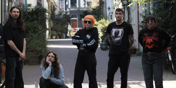
artist john f. malta on the punk aesthetics of a 7" collection
The illustrator and comics artist sits down for the first installment of “Art Punk,” an interview series where visual artists discuss the punk record covers


“Art Punk” is a new see/saw interview series where visual artists discuss punk record covers.
John F. Malta will not be in his maximal Kansas City office for much longer—a move is imminent—but the space paints a clear picture of his overall artistic moodboard. There’s color everywhere, pop culture exploding across his shelves, Tetsuya Naito over one shoulder, The Simpsons’ Jimbo Jones over the other. Punk and wrestling permeate his illustrations and comics, where bendable figures don toothy scowls and zero pupils.
“The cocktail of my work is the aesthetics of early punk graphics and the energy of professional wrestling,” he said. Malta grew up in Cleveland going to punk shows during high school, which imprinted on him both aesthetically and philosophically. He still goes to punk shows all the time, but those teenage experiences were understandably formative. “I was drawing a lot at that time, so that started to lay the groundwork for the way I draw now.”
His work includes posters for iconic films and TV shows, and one of his best was for Wayne’s World. “I got a copy of Wayne’s World from McDonald’s on VHS in the early ’90s and just wore that out,” he said. “When I was a kid, I was like, ‘Oh I hope I can be an adult like Wayne Campbell when I’m older. That was my goal as a four- or five-year-old.”
Malta recently self-published the comic Rotten Metropolis, a dystopic piece that’s more autobiographical than it might appear. It’s based on video conversations between him, his younger brother, and his cousin on the Marco Polo app. “My little brother has been sending me lots of great reflections on our childhood and I’ve been transcribing them, and I’ve wanted to drop them into a story, but I didn’t necessarily want to make something specifically the story of my life.”
Those stories became lore for Gunk the Punk, Rotten Metropolis’ protagonist. “He has a computer installed inside his head. You’re seeing him go throughout his day and fight gigantic bats and eat weird food and listen to music and then he'll cue up a memory. Really, it’s something that happened between my little brother and I.”
Malta’s work hangs in the personal cigar lounge of the wrestler Taz and has appeared in museums. He was kind enough to choose and discuss the aesthetics of five 7" records from my collection.
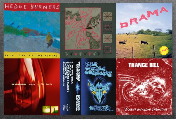
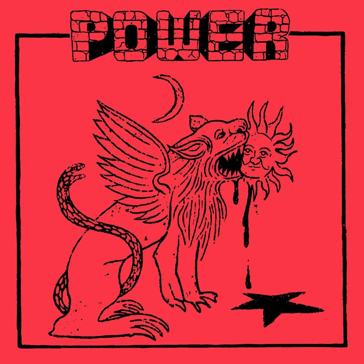
Power: The Fool [Feel It, 2019]
That style of punk that infuses glam and rock'n'roll together, I love so much. One thing that it always reminds me of, and this like one of the first things I thought of when I listened to that song’s riff, is that scene in Wayne’s World where they're first going to Gasworks and going to see a concert. I know the music that’s played in that probably isn’t as hard as this, but this interview had me reflecting on what were really early memories of being interested harder, heavier music and those scenes came to my mind when I heard “The Fool.”
I don’t know a lot about tarot cards, so I looked up to see if it was like a variation of The Fool, but The Fool is...I don’t really want to speak about tarot like I know what I’m talking about, but the graphics I’ve seen were not like this. The thing that drew me to this one outside the music, the reason I chose it, was because I love the typography. It’s that hand-drawn brick type that’s so iconic and eye-catching, and just the minimal use of black line on like a red flat red cover just looks so good. The sketchy sort of rough quality of the drawing, too, is great.
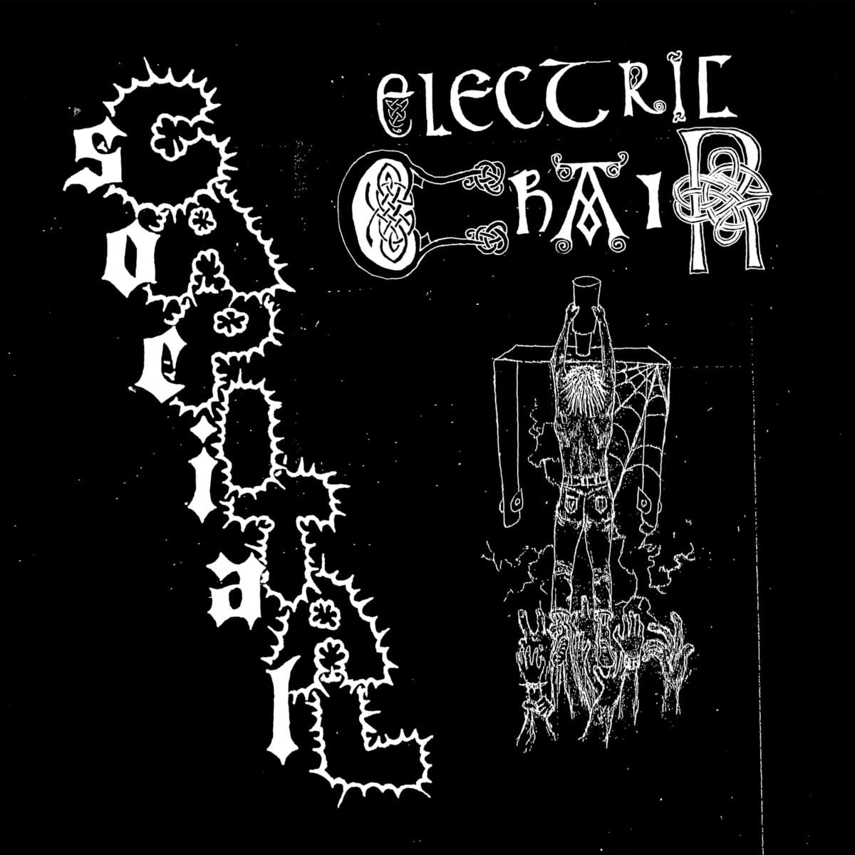
Electric Chair: Social Capital [Iron Lung, 2021]
I love the band Electric Chair. That’s one of the bands on the list you shared that's on a lot of playlists I make. I had not heard this 7", and yeah, that first song on this—“Bastards”—is just so hard. It starts with this great heavy riff, and yeah, the overall aesthetic here is great. The different type uses in “Electric” and “Chair?” I love the drawing kind of shoehorned underneath the type, and then the blast—the electric “Capital”—is really great. There’s so many good things going on.
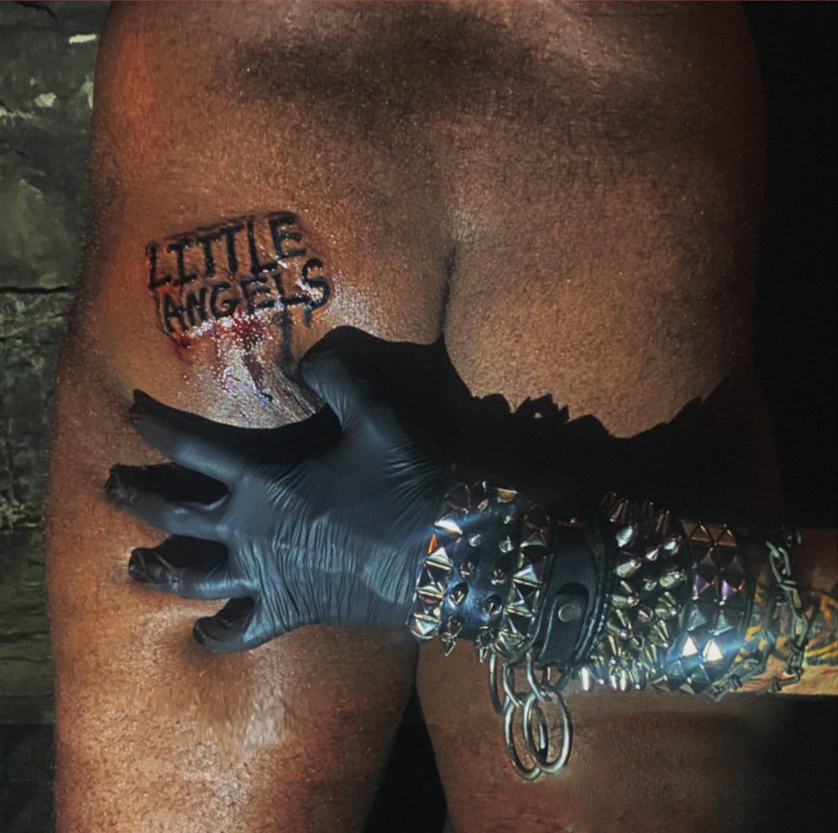
Little Angels: Psycho Summer [11PM, 2023]
The black glove is really cool, and the tattoo? Yeah, it’s a classic cover. Everything about that opening song “S.I.C.” is perfect—the blast beats, the crunchy guitars, the howling vocals? Nine songs in 10 minutes? That’s a perfect ratio. But yeah dude, that cover is so good.
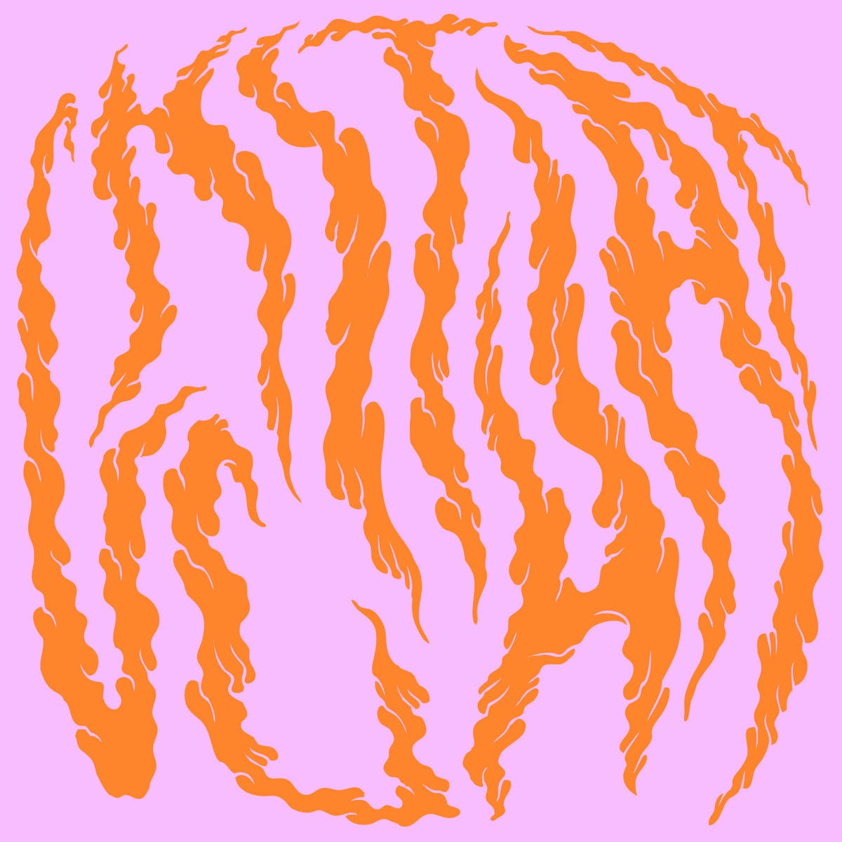
Chit Chat: Chit Chat [PRTYNGG!, 2012]
I’ve always been into different kinds of older surf music. There’s this surf compilation that I love called Surfbeat Behind the Iron Curtain that's really great. I really love the track “Jelly” on this. It’s two minutes of surf guitar and I really love their range of vocals—they have a different role in this, too.
The psychedelic typography here is so good, just the pink and orange together I think look really great. I always love bands that make you decode what their name is or decode what you're looking at. It's the kind of record that you would see in a store and be like, “OK, I think I'm gonna like this,” and because it’s a 7" you pick it up.
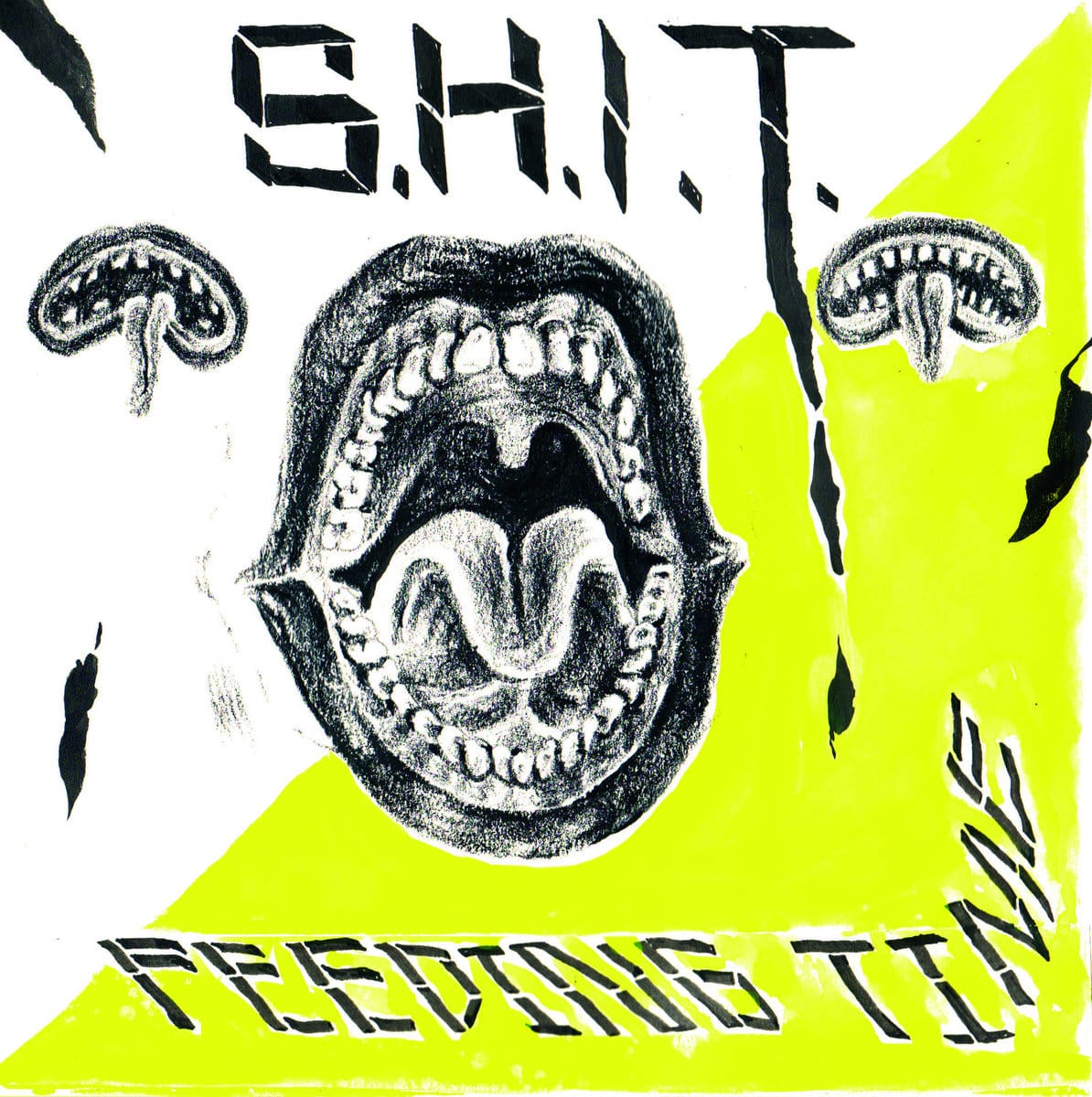
S.H.I.T.: Feeding Time [Static Shock, 2014]
It’s very noisy, very chaotic, and just very distorted. The title track “Feeding Time” just slowly builds, everything homogenizes maybe 30 seconds into the song and just goes crazy, like you can kind of hear it all, kind of. It’s almost like a haunted house cassette or something.
The art is great, it’s done by Sam Ryser. I was looking it up and was pretty sure that was his work. I think in talking about current punk graphics and stuff, Dripper World is crucial. I lived in New York City for a while and that whole little punk alley in Brooklyn is so sick. Actually [points to a tattoo] this is from Street Fever, the tattoo shop that’s in there. Dropper World was in there for a while, and the graphics are so great. The graphite drawings of open mouths match the way the band sounds so well. It’s cool when a cover reflects the music in a way. That neon yellow color just looks like highlighter, almost like it’s quickly scratched onto it.
see/saw is a reader-supported publication. If you enjoyed this article, please consider a paid subscription or grabbing some merch to support this independent punk journalism operation.